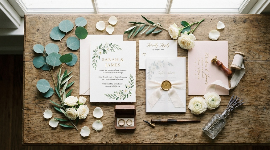
A couple in Orlando spent $1,200 on beautifully designed custom invitations with rustic barnwood motifs and wildflower illustrations — then held their wedding at a sleek modern waterfront venue. Every guest noticed the disconnect. The invitations told one story; the wedding told another. Choosing custom wedding cards Florida couples love means aligning every design element — typography, color, imagery, paper — with the actual wedding theme and venue, not choosing a design in isolation because it looks pretty on a screen. A personalized wedding invitation succeeds when guests receive it and immediately sense what the celebration will look and feel like, building excitement rather than confusion.
Custom invitations are an investment — they cost more than templates because you’re paying for design that’s uniquely yours. But that investment only pays off when the custom design actually reflects your wedding. A gorgeous custom invitation that contradicts your venue, colors, and atmosphere wastes the customization opportunity. The whole point of going custom is coherence — creating a stationery suite that previews your specific celebration so perfectly that walking into your venue feels like walking into the invitation. Here’s how to pick a custom wedding cards Florida design that matches your wedding theme flawlessly.
What Does It Mean for an Invitation to “Match” Your Wedding Theme?
Matching means the invitation’s visual language — colors, typography, imagery, paper texture, and formality level — creates the same emotional impression as your actual wedding will. Guests should feel the same vibe from the card that they’ll feel walking into your venue.
The matching elements:
- Color palette: The invitation’s colors should echo your wedding’s color scheme — not necessarily identical, but harmonious and suggestive of the same palette.
- Typography: Formal script for formal events, modern sans-serif for contemporary celebrations, hand-lettered for bohemian/casual. Type sets the tone instantly.
- Imagery/motifs: Design elements that reflect the venue or theme — tropical plants for garden weddings, geometric patterns for modern events, vintage florals for romantic celebrations.
- Paper texture and weight: Rough, textured paper for rustic themes; smooth, heavy stock for formal; modern matte for minimalist.
- Formality level: The overall presentation should match the event’s dress code and style. Black-tie invitations look and feel different from casual beach celebration cards.
How Do You Translate a Wedding Theme into Invitation Design?
Translate your theme by identifying 3–5 defining visual elements of your wedding (venue architecture, floral choices, color palette, fabric textures, lighting mood) and finding design equivalents for each on paper.
Theme-to-design translation:
| Wedding Element | Invitation Design Equivalent |
|---|---|
| Beach/oceanfront venue | Watercolor washes, coastal palette (blues, sand), relaxed layout |
| Formal ballroom venue | Heavy stock, classic serif type, foil accents, structured layout |
| Tropical garden | Botanical illustrations, green/coral palette, organic shapes |
| Modern gallery/loft | Minimalist design, sans-serif type, geometric elements, monochrome |
| Romantic estate | Soft florals, calligraphy, blush/ivory palette, deckled edges |
| Rustic/farm | Kraft paper, hand-drawn elements, earth tones, natural textures |
The process: take photos of your venue, gather your color swatches, note the architectural style, and share these with your designer or use them as reference when selecting design elements. The invitation should feel like a 2D version of the 3D experience your guests will walk into.
How Do You Brief a Designer for Custom Wedding Invitations?
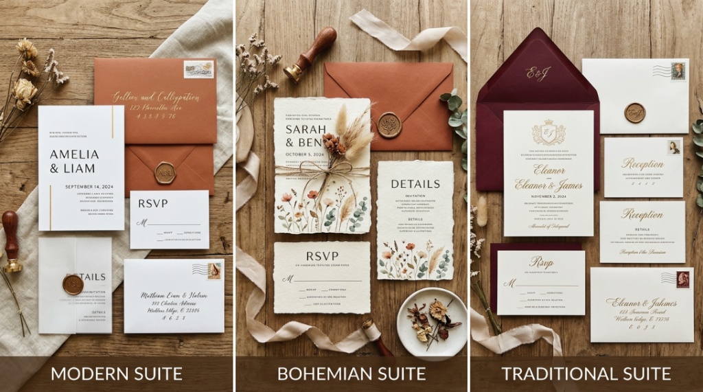
Brief a designer effectively by sharing your venue photos, color palette, formality level, cultural considerations, must-include information, and 3–5 invitation examples you love — giving them both the practical requirements and the aesthetic direction.
Essential brief elements:
- Venue photos and architecture: Show the designer where the wedding happens. This informs design language more than verbal description.
- Color palette: Share exact colors (Pantone numbers ideal, or close photo examples). Eliminates guessing.
- Formality level: “Black-tie garden reception” gives clearer direction than “elegant.” Be specific.
- Inspiration examples: 3–5 invitations you love, noting what you like about each. Shows taste direction better than words.
- What you DON’T want: Equally important — share designs you dislike and explain why. Prevents wasted revision rounds.
- Practical requirements: Guest count, language needs, cultural elements, number of event cards, suite components needed.
- Budget: Be upfront about budget so the designer can recommend appropriate techniques and scale.
What Are Common Theme-Matching Mistakes?
Common mistakes include choosing designs you love in isolation (without considering venue match), following trends that contradict your actual wedding, mismatching formality levels, and overcrowding the design to include “everything” rather than suggesting the theme with restraint.
Theme-matching mistakes to avoid:
- Design-in-isolation: Falling in love with a design on Pinterest without checking if it matches your actual venue and colors. Pretty doesn’t mean appropriate.
- Trend-following without fit: Choosing a trendy design (arch shape, acrylic, bold tropical) because it’s popular, not because it matches your traditional ballroom wedding.
- Formality mismatch: Casual, handwritten-style invitations for a black-tie event (or vice versa). The formality must match.
- Over-literal interpretation: A beach wedding doesn’t need seashells and starfish all over the card. Subtle coastal elements (blue palette, watercolor wash, relaxed type) suggest the beach more elegantly.
- Too many themes: Trying to incorporate every element (beach + tropical + formal + vintage) creates confusion. Choose your dominant theme and commit.
Should You Design Based on Venue or Personal Style?
Design based on BOTH — use the venue to inform the overall tone and visual language, then layer your personal style (cultural elements, color preferences, typography taste) on top. The venue provides the framework; your personality provides the details.
The blending approach:
- Venue provides: Overall formality level, appropriate imagery/motifs, spatial feeling (airy vs. intimate), color context.
- Personal style adds: Specific color preferences, cultural elements, typography that reflects your personality, unique details meaningful to you as a couple.
- The result: An invitation that looks like it belongs to your venue AND belongs to you — cohesive and personal simultaneously.
Example: A couple choosing a tropical garden venue (venue influence: botanical elements, green palette, organic shapes) who loves modern minimalism (personal style: clean lines, restraint, white space) might create an invitation with a single botanical line drawing on heavy white stock with modern typography — combining venue context and personal aesthetic perfectly.
How Do You Ensure Consistency Across the Stationery Suite?
Ensure suite consistency by establishing design rules (color palette, typography hierarchy, imagery style) that apply across every piece — from save-the-date through thank-you cards — creating a cohesive visual story rather than disconnected individual pieces.
Consistency framework:
- Fixed color palette: Maximum 3–4 colors used consistently across all pieces. No random new colors on individual cards.
- Typography hierarchy: Same 2–3 fonts in consistent roles (headings, body, accent) across all stationery.
- Imagery style: If the invitation uses watercolor florals, the program, menu, and place cards should use the same style — not switching to photography or geometric patterns.
- Paper consistency: Same or complementary paper stock throughout the suite. Mixing paper qualities looks disjointed.
- Design element repetition: A motif from the invitation (monogram, botanical, border) should appear in simplified form on other pieces — creating recognition and cohesion.
How Much Should Custom Theme-Matched Invitations Cost?
Custom theme-matched invitations cost $500–$2,000 for design plus $3–$12 per suite for printing, depending on complexity, printing technique, and embellishments. Semi-custom (modifying existing designs) achieves similar results for $200–$600 total design cost.
Custom pricing breakdown:
- Semi-custom design ($200–$600): Modifying existing designs with your colors, text, and minor elements. Achieves theme-matching at lower cost. Best value for most couples.
- Fully custom design ($600–$2,000+): Designer creates from scratch based on your brief. Unique to you, maximum theme alignment. Best for couples wanting one-of-a-kind.
- Printing per suite ($3–$12): Varies by technique (digital $3–$5, thermography $5–$8, letterpress $7–$12). Plus paper, envelopes, and finishing.
Value tip: semi-custom design achieves 90% of fully custom theme-matching at 30–50% of the cost. A skilled designer can modify existing elements to match your theme perfectly without starting from scratch. Reserve fully bespoke for truly unique wedding concepts that existing designs can’t accommodate.
Conclusion
Picking a custom wedding invitation that matches your theme comes down to translating your wedding’s visual experience — venue, colors, formality, and personal style — into paper form. The invitation should give guests the same feeling they’ll experience at your celebration, creating coherent expectations and building excitement. This requires intentional matching of design elements to your actual wedding, not choosing based on isolated aesthetics or trends.
Start with your venue and color palette as the foundation, add your personal style as the personality layer, brief your designer with photos and specific direction, and maintain consistency across the full stationery suite. Whether you choose semi-custom ($200–$600 design) or fully bespoke ($600–$2,000+), the result should feel like a natural preview of your celebration — cohesive, personal, and unmistakably yours. An invitation that matches your theme doesn’t just look good; it tells the right story.
What’s your venue and color palette? Share in the comments — I’ll suggest specific design directions and imagery that match your wedding theme.
Once you have perfectly aligned your stationery with the aesthetic of your venue, it is time to think about how your personal style carries through to your bridal look. Just as your invitations set the tone for the day, your hair completes your overall aesthetic on the runway. If you are planning an autumn celebration, exploring trending Fall Wedding Hairdos for Every Bride’s Vibe will ensure your hair design harmonizes beautifully with the theme you’ve established.
Frequently Asked Questions
How do I match my wedding invitation to my venue?
Share venue photos with your designer or use them as reference when selecting design elements. Match the invitation’s formality level, color palette, and imagery to the venue’s architectural style and atmosphere. The invitation should feel like a 2D version of the 3D experience guests will walk into.
How much do custom wedding invitations cost?
Semi-custom design costs $200–$600; fully custom costs $600–$2,000+. Plus printing at $3–$12 per suite depending on technique. For 100 suites, total ranges from $500 (semi-custom + digital printing) to $3,000+ (fully bespoke + letterpress). Semi-custom achieves 90% of custom results at lower cost.
Should I design my invitation before or after choosing my venue?
After choosing your venue. The venue provides essential design context — architecture, surroundings, formality level, and color environment. Designing before venue selection risks creating an invitation that contradicts where the event actually happens. Wait until your venue is confirmed.
Can I use a template and still match my wedding theme?
Yes — many templates are customizable enough to match specific themes through color, font, and imagery changes. Choose a template whose structure (layout, style category) matches your formality level, then customize colors and text to align with your specific wedding. This achieves theme-matching at template pricing.
What if my wedding has multiple themes or venues?
Choose the dominant theme (the one guests experience most — usually the reception) as the invitation’s design direction. For multi-venue events, the invitation can reference the ceremony location while the overall design reflects the reception atmosphere, since that’s where guests spend most time.
How do I avoid an invitation that looks generic?
Add personal elements: custom monogram, venue illustration, cultural details, meaningful quotes, or unique paper color. Even one personalized element transforms a standard design into something uniquely yours. The key is specificity — details that could only belong to your wedding, not any wedding.